Keto Burn Supplement
Company
Pure Optimum
Project Type
Brand Identity & Packaging Design
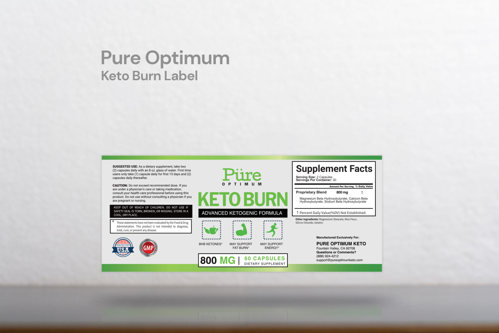
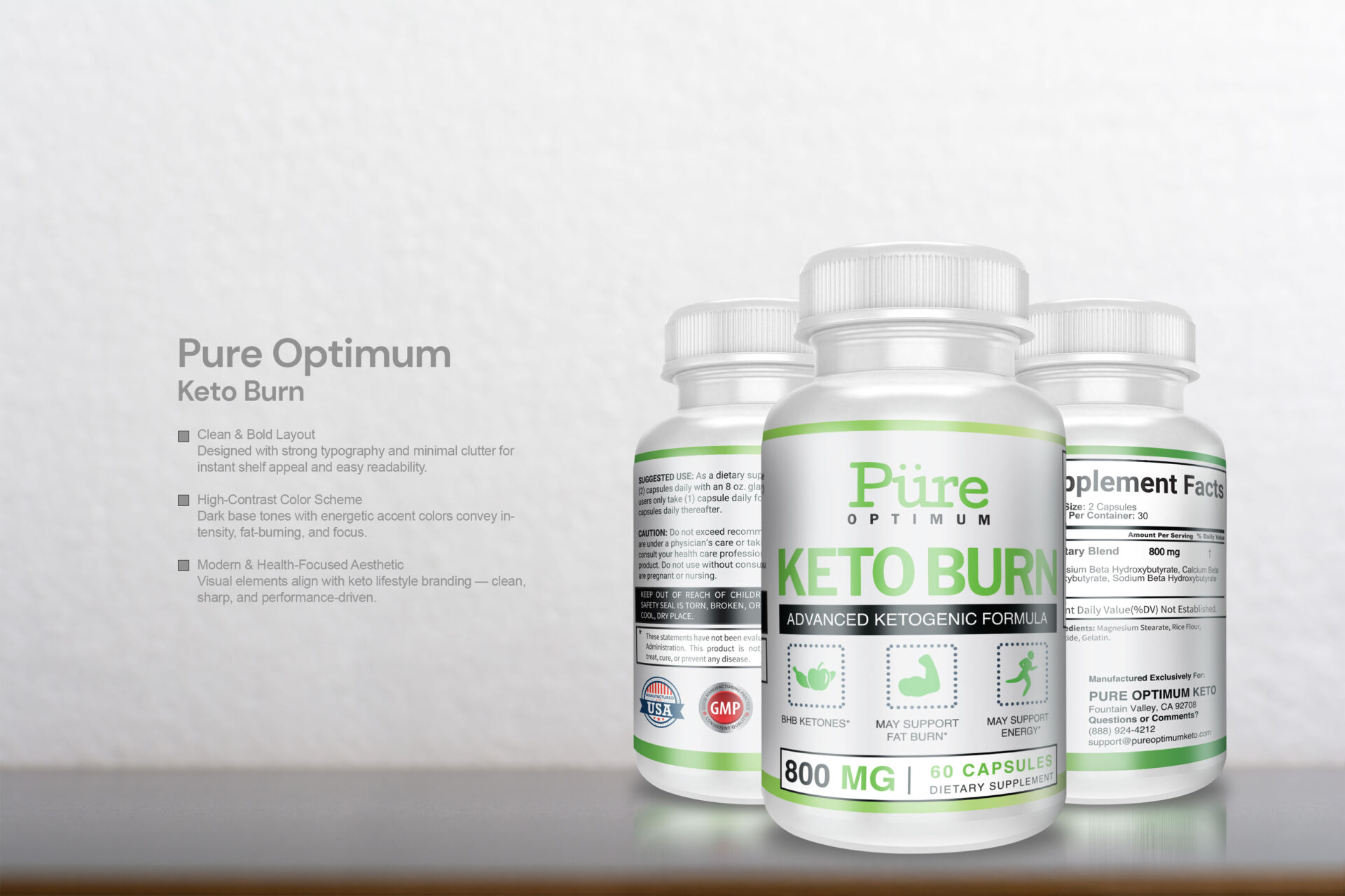
Created the Keto Burn bottle label using a clean, high-contrast layout to reflect the product’s focus on energy, fat-burning, and a modern health-conscious lifestyle. The bold typography ensures readability, even at a distance, while the use of dark tones with vibrant highlights suggests strength and metabolic intensity. Every element—from spacing to color choice—was intentionally crafted to balance visual appeal with a professional, trustworthy appearance that resonates with keto-focused consumers.
Bottle Images
Label